
Website user experience: from audit to the meeting
Website user experience: criteria, a step-by-step UX audit method, and social media. Turn every flaw you spot into an argument that wins clients.

In short
- UX is the visitor's overall experience across the full interaction, not just how one screen looks.
- A solid UX audit combines fixed criteria (navigation, mobile, speed, forms, calls to action, accessibility) and ranks issues by impact and effort.
- A quantified, located flaw on a local business's site beats a generic hook in a first message.
- AutoLeads audits sites for businesses in a sector and city, then drafts outreach sequences from the issues found.
Website user experience is what a visitor feels from the first screen through the action they came for: call, book, buy. For an agency or freelancer, it works twice. It guides your own design recommendations, and it gives every prospect a concrete argument: a specific flaw on their site, instead of a "your site looks dated" line everyone sends. This article covers the criteria, a step-by-step audit method, and how to turn it into a prospecting lever.
What user experience really covers
IBM defines user experience as the overall experience of a person interacting with a product, system, or service: ease of use, accessibility, visual design, interface features, and emotional impact. The HEC Montréal UX Research Chair adds a point that matters for your work: experience is judged end to end and depends on context of use, as well as the person's cognitive and emotional state. A tradesperson reviewing your mockup on a phone between jobs does not have the same experience as you at a large monitor.
UX and UI: do not mix them up in outreach
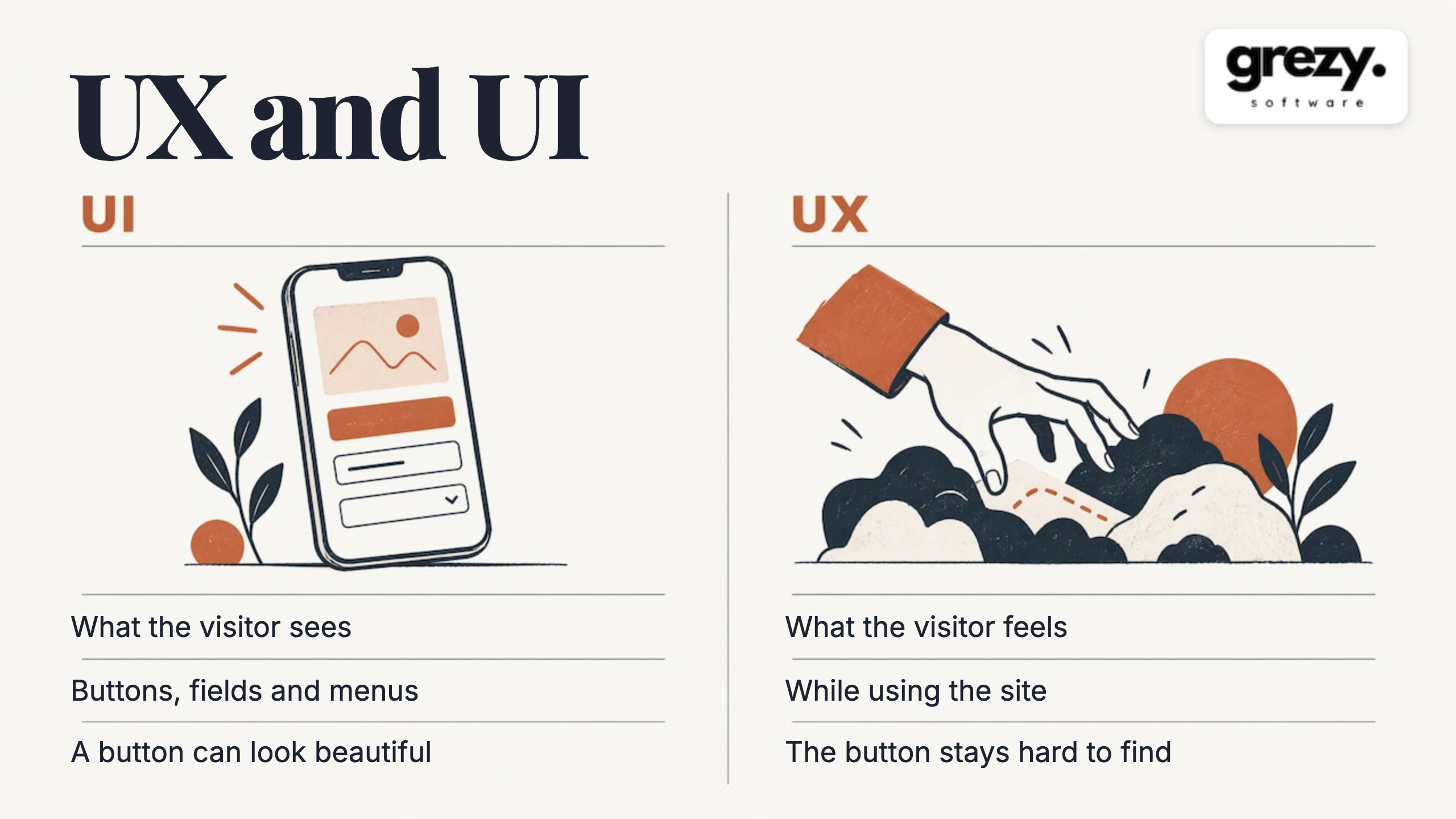
UI (user interface) is what the visitor sees and uses: buttons, form fields, menus, pop-ups. UX is what they feel while using it. A beautiful button placed where no one looks for it is good UI and bad UX.
The distinction matters in prospecting. Telling a restaurateur that "their design is outdated" is about aesthetics, where everyone has an opinion. Showing that the phone number is not tappable on mobile, or that the menu is an unreadable PDF, is about lost customers. The second message can be checked in ten seconds.
Why UX is your strongest sales argument
IBM explains that well-designed UX can improve satisfaction, loyalty, and business results, and that a smooth experience reduces friction that blocks conversion. For a small business owner, it comes down to this: a site that does not make the phone ring has not done its job.
That is why a UX audit is the best entry point with a local prospect:
- It is concrete. Every issue has a location, a screenshot, and a possible fix.
- It speaks the owner's language. Fewer quote requests, fewer bookings, no jargon.
- It proves you looked. A message that cites a specific page stands out from bulk outreach.
- It naturally leads to a quote. Quick fixes, technical work, and partial or full redesigns are easy to price.
The problem is not knowing how to audit. It is doing it at scale: auditing thirty sites by hand before writing to one prospect is not realistic for a solo freelancer or a business developer with a full calendar.
Criteria for a website UX audit
An audit grid must stay short, or you will never apply it across dozens of sites. Here are the criterion families to review, in the order a visitor encounters them.
1. First impression and value proposition
In five seconds, the visitor must understand who you are, what you offer, and which area you serve. For a plumber in Lyon, that means trade, city, phone number, and main action visible without scrolling.
2. Navigation and structure
Is the menu readable? Are sections named with the customer's words? On mobile, Google notes that users expect to return home by tapping the logo. That is a ten-second test that exposes many rushed builds.
3. Calls to action
The same Google guide states that primary calls to action should sit in a clearly visible area, with secondary actions in the menu or lower on the page. It also recommends promotional banners that are easy to dismiss rather than large interstitials. The guide dates from 2014: keep the principles, not the exact numbers.
4. Mobile display and speed
Most local searches ("plumber Lyon," "restaurant Bordeaux") happen on phones. Overflowing text, buttons too close together, heavy images: these are the most common and easiest flaws to show.
5. Forms and contact
How many fields, a confirmation message, a clickable number, a booking slot? Every unnecessary field is friction.
6. Content and reassurance
Rates or ranges, service areas, customer reviews, real photos, legal notices. A local site with no visible reviews asks the visitor to trust blindly.
7. Accessibility and readability
Contrast, text size, field labels. This is both a UX criterion and a compliance topic you can raise without being aggressive.
8. Data tracking
Does the site measure anything? A site with no analytics or call tracking gives the owner nothing to prove and nothing to improve.
A six-step UX audit method
For a client site or a prospect, the same sequence applies. At each step, here is what it requires and where it goes wrong.
Step 1: choose priority journeys
Do not audit "the site." Audit two or three journeys: find the service, check the area, contact the business. For a Shopify store, that might be product page, cart, checkout. This is where teams scatter: without target journeys, the audit becomes a list of personal taste.
For small businesses, good framing starts with understanding their customer journey: how a customer arrives, what they expect, when they decide. That work keeps you from judging a site on criteria unrelated to the real business.
Step 2: gather data before judging
If you have site analytics, look at entry pages, exit pages, and devices used. If available, add heatmaps and session recordings. IBM notes that interviews, surveys, and usability tests collect feedback and improve experience iteratively.
For a prospect, you do not have that data. You rely on what is visible from the outside: structure, load speed, mobile display, reviews, SEO signals.
Step 3: apply a heuristic grid
The most common grid in French audits uses Jakob Nielsen's ten heuristics (visibility of system status, match with the real world, error prevention, consistency, and so on). Its value is reproducibility: two people who apply it reach similar findings.
Step 4: record each issue in a usable way
A useful issue fits one structured line: where it is, which criterion it breaks, its effect on the visitor, and which fix would remove it. "Navigation is confusing" is worthless. "The mobile menu hides the Pricing page behind three levels" can be fixed and sold.
Step 5: rank by impact and effort
Sort fixes into three buckets: quick wins, technical projects, partial or full redesign. High impact and low effort comes first. That ranking also builds your offer: quick wins as an entry service, redesign as a project.
Step 6: deliver a short summary
Five to ten major issues, an action plan, a clear priority. Beyond that, the owner stops reading. For a prospect, the summary fits in three lines in an email, with an offer to discuss the rest.
Where manual audit breaks down, and what we do for you
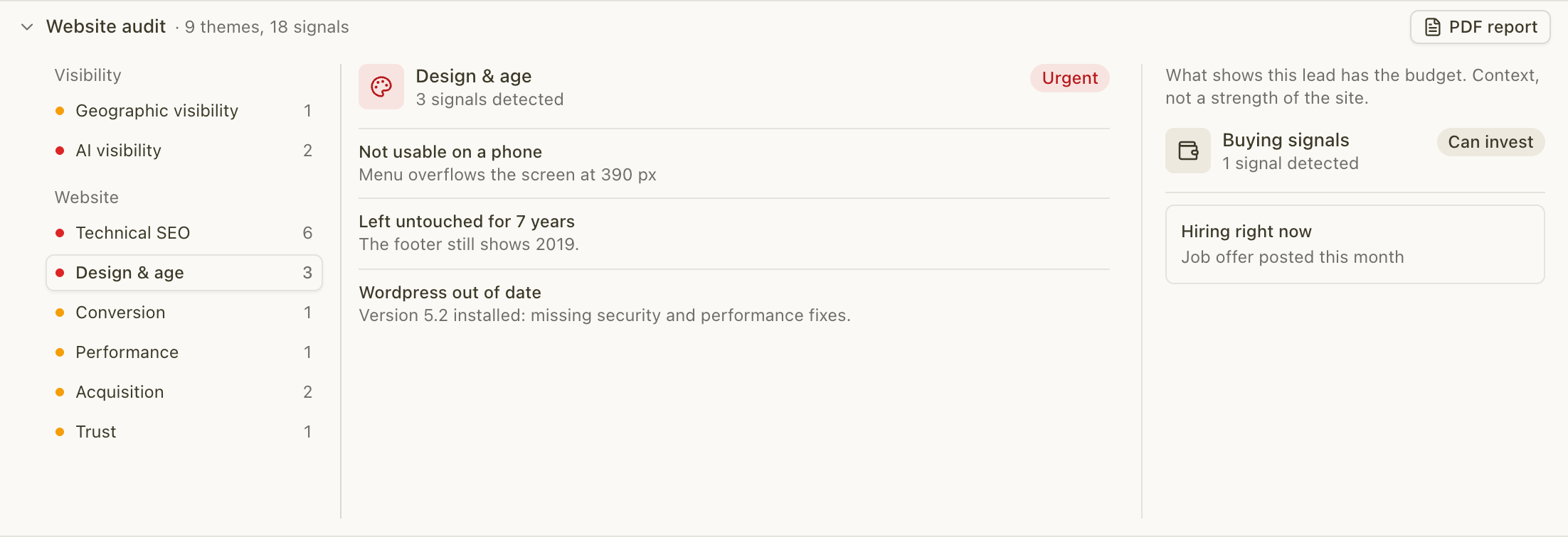
Steps 2 through 6 take time when you repeat them across dozens of businesses. With AutoLeads, you choose a sector and a city, for example "plumbers in Lyon" or "restaurants in Bordeaux". The tool finds those businesses in real time on the web and Google Maps, audits their online presence (outdated or slow site, weak SEO, Google reviews, social media), and writes a sequence of emails and LinkedIn messages for each one based on real flaws on their site. You spend your time talking to the owner, not collecting data.
Example: from finding to first message
Imagine, for illustration, a Bordeaux restaurant whose site is slow on mobile, whose menu is a PDF, and whose reservation button only appears at the bottom of the page.
A generic message might say: "I saw that your site could be improved." An audit-based message might say:
"Hello, when I looked at your restaurant's site on a phone, I noticed the menu opens as a PDF and booking is only available after a long scroll. A fixed button at the top of the screen and a menu readable directly on the page would shorten the path. Would you have ten minutes this week for me to show you the rest?"
That text cites two flaws, suggests a simple fix, and asks for a short slot. It promises no numbers you could not back up.
The prospect's view: Google Business Profile first
For many small businesses, the Google Business Profile is the real storefront, even before the website. A guide on optimizing your Google Business Profile reminds you that this profile anchors a business's online presence. In your audit, check consistency between the profile, reviews, and site: same hours, same phone, replies to reviews. An inconsistency is an easy flaw to cite, and it speaks immediately to a shop owner.
Auditing a company's social media
The site is only part of what a potential customer sees. For agencies that also sell social ads or community management, a social media audit completes the UX audit with the same logic: observe, quantify, prioritize.
Audit steps
Asana outlines seven steps: list all profiles (including inactive or fraudulent ones), check brand completeness and consistency (handle, cover image, bio, contact details), spot trends by platform, set goals, identify the most effective platforms, assign an account owner, and set an action plan to renew every quarter.
For a local business, the most telling findings are simple: a profile abandoned for months, a bio with no link to the site, comments left unanswered.
Metrics to watch
DW Akademie distinguishes reach, which measures unique people touched, and impressions, which count views, and presents engagement through interactions: clicks, shares, reactions, comments. Always compare a post to the same account's history, and read each metric by the platform's definition, which varies by network.
From the outside, you mostly see public elements: posting frequency, visible interactions, profile consistency. That is enough for an opening line, not for a full report: that requires account analytics, which you get once the client is signed.
Turning the audit into a meeting
An audit that stays in a spreadsheet earns nothing. Moving to action takes four moves.
- Target a visible need. A business with a slow site, poor mobile readability, or no reviews has a need you can show.
- Reach the right person. The owner, with a verified email or phone, not a generic inbox.
- Write from the flaw. One or two findings, a fix, a short question.
- Follow up on replies. An unanswered reply is a lost client.
AutoLeads enriches each lead with the owner, a verified email, and a phone number, then sends sequences in weekly waves from your agency mailboxes, or pushes them to HubSpot. Replies land in a built-in CRM as tasks. That is how you stop depending on word of mouth, freelance platforms, or RFPs.
From audit to prospecting with AutoLeads
If you want to approach each local small or mid-sized business with a concrete diagnosis instead of a generic message, AutoLeads does that for you from a sector and a city. It is offered as a monthly subscription: Starter at €249 per month, Growth at €499 per month, and Scale at €899 per month, with credits consumed based on lead volume and enrichments enabled. The "We make the calls for you" option handles outsourced appointment setting.
You can compare plans and create your account on the AutoLeads offers page.
Our view
We see the same pattern with agencies that write to us: they know how to audit, but they do not have time to do it before every outreach. So they send the same message to everyone, and it looks like what the owner already received.
Our belief is simple: an audit only helps if it arrives at the right moment, in the right message. That is why AutoLeads detects businesses with a visible need in real time, without a static database or stale open data, and writes each sequence from real flaws on the company's site: SEO, advertising, customer reviews, performance.
The agency's job is still what it always was: understand the client's business, propose the right solution, and defend it in a meeting. What we take off your plate is the repetitive collection and writing that comes before that moment.
Tom
Frequently asked questions
Sources
- What is user experience (UX)? | IBM(opens in a new tab) accessed November 18, 2026
- User experience (UX), HEC Montréal UX Research Chair(opens in a new tab) accessed November 18, 2026
- Principles of mobile site design, Think with Google(opens in a new tab) accessed November 18, 2026
- Measuring audience on social media, DW Akademie(opens in a new tab) accessed November 18, 2026
- Your social media audit in 7 steps, Asana(opens in a new tab) accessed November 18, 2026